
How Can We Help?
Pure Academy: Test Your Knowledge - ReportingPure Academy: Test Your Knowledge - Reporting
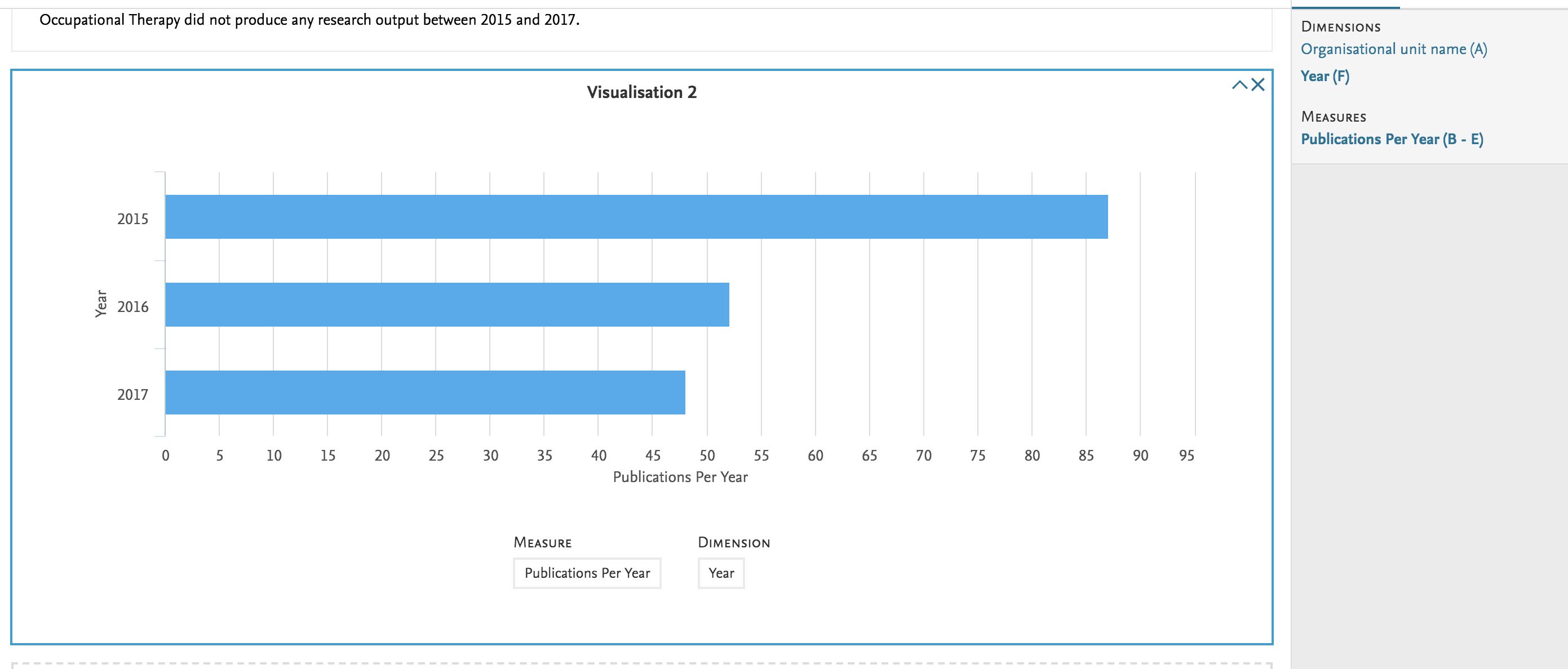
Pure Academy reporting will be closed down at the end of this year.
You can learn about reporting at the Pure University Reporting course in Pure University: Client Certification Program
Content below is outdated.
Now that you have completed select classes on reporting, you can use the below to test what you've learned.
Foundation Classes
Required
Foundation classes part 1 through 3 on the new report module (see Pure Academy: Reporting in Pure ).
Quiz
Explain what a data table vs. a data story is?
Data Table: The area in which you define the columns that constitute your report and view the rows of data that match your filter settings.
Data Story: A series of visualizations based the columns and rows available in a data table.
What components are required to create a data story?
Dimension: a field that is used to group or separate the data for the purposes of the visualization, e.g. the value that splits the data into different slices of a pie graph, or into different buckets for the column or bar graph.
Measure: usually a type of field which can be counted, such as the number of research outputs, and usually indicates the size or proportion of the resulting visualization.
What is a driver variable?
The 'driver variable' is the content type in the left-most column in the reporting workspace. It is chosen on the Create new workspace tab when creating a report and cannot be changed/or deleted once the report is created. Choosing the right driver variable can simplify the process of creating your report.
How can you share a report with others at your institution and if that user has roles assigned at an organizational level what will they be able to see in shared reports?
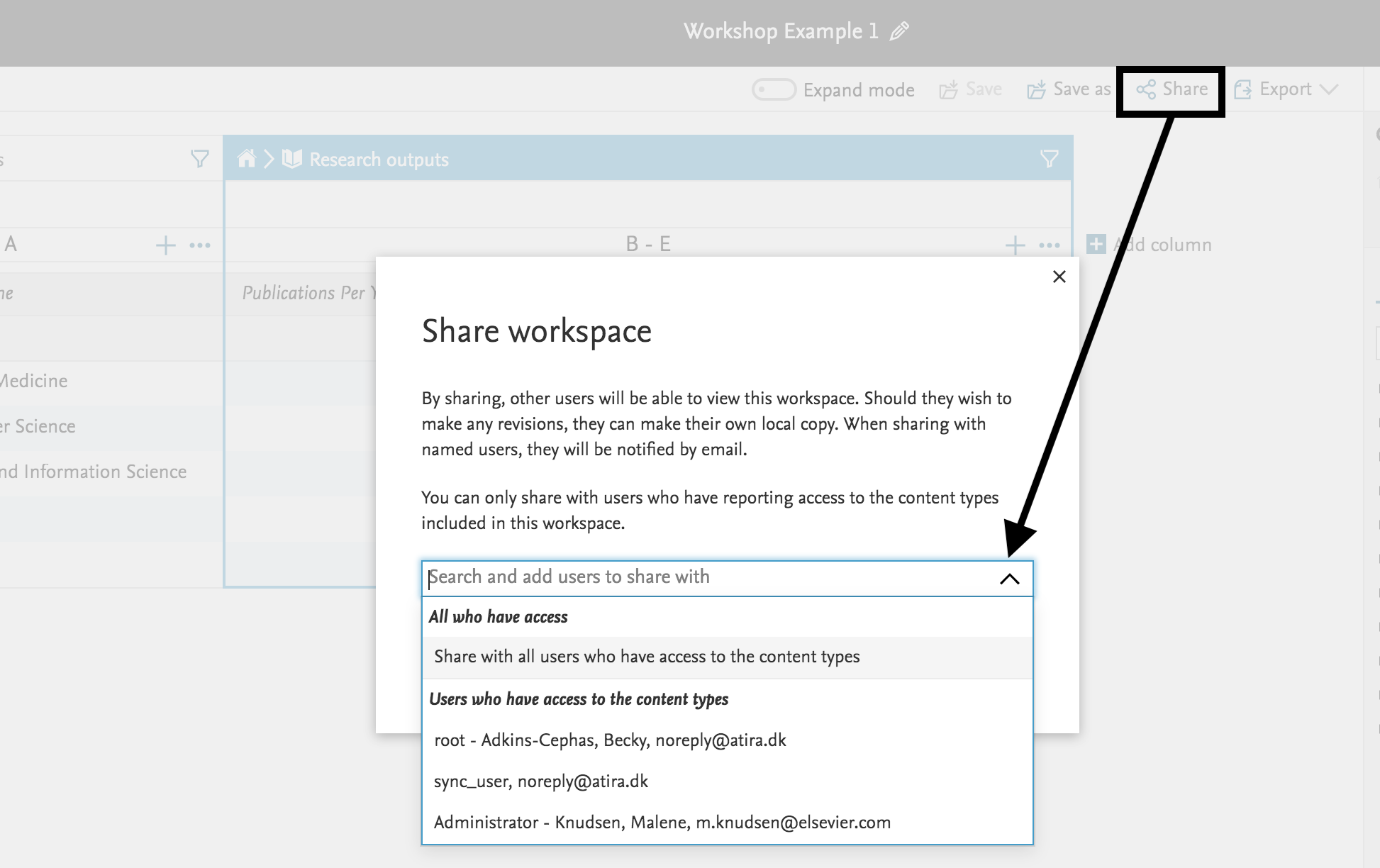
- When sharing a workspace you are prompted to choose who will receive access. The list of recipients is limited by their role. You can select to either share the workspace with all users who have access (All who have access), or select a recipient from a list of users whose roles give them access to the content type that drives your report. The way that you share the report influences where the report can be opened from.
- Note: these users you share with will only have read access to the workspace; they will not be able to make changes (unless do a save as).
- Those with roles at an organizational level, although they have access to the structure of your workspace and any text elements in a data story, they can only see rows that reflect the values they have permission to access (and any associated graphics will reflect the numbers in their version of the workspace).
When can you use expand mode?
You can use the Expand mode in the data table to show details for cells where the cells contain too much information to display normally, i.e. where the information is nonnumerical information that cannot simply be summed together. The rows that contain too much information are then expanded into multiple rows, one row for each entity, even if this means that rows appear to be repeated.
What is meant by splitting content?
To split a column means to see how numerical values are broken down into several categories.
Note: Not all columns can use the Split feature; you will want to try and select columns with a numerical value, such as 'Number of research outputs', or a count or sum of entities.
Practice Exercises
Note: The examples below were designed so that you can build these with the data in your own Pure instances.
The answers are pulled from a test server used for Pure Academy classes and are designed to give you an idea of what the report would look like, it may look slightly different when you use your own data.
| Exercise #1 |
|---|
|
|
Solutions #1 Data Table solution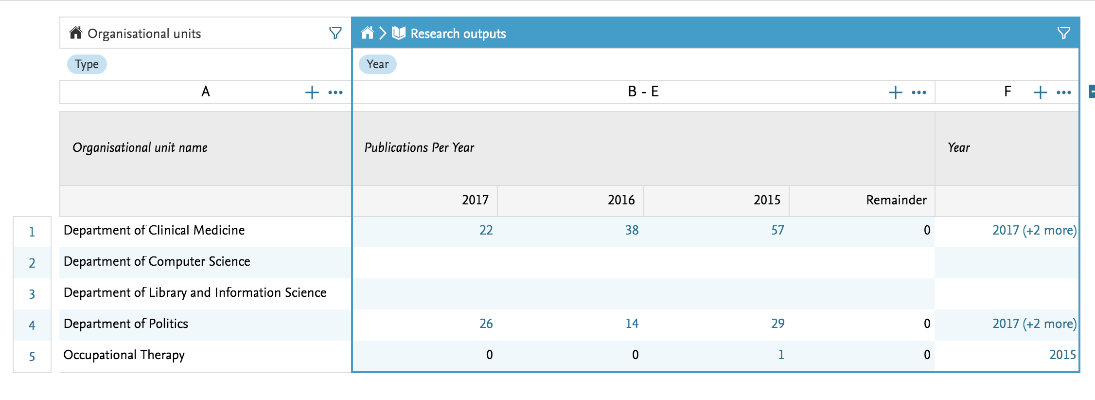
|
| Exercise #2 |
|---|
|
|
Solutions #2 Data Table solution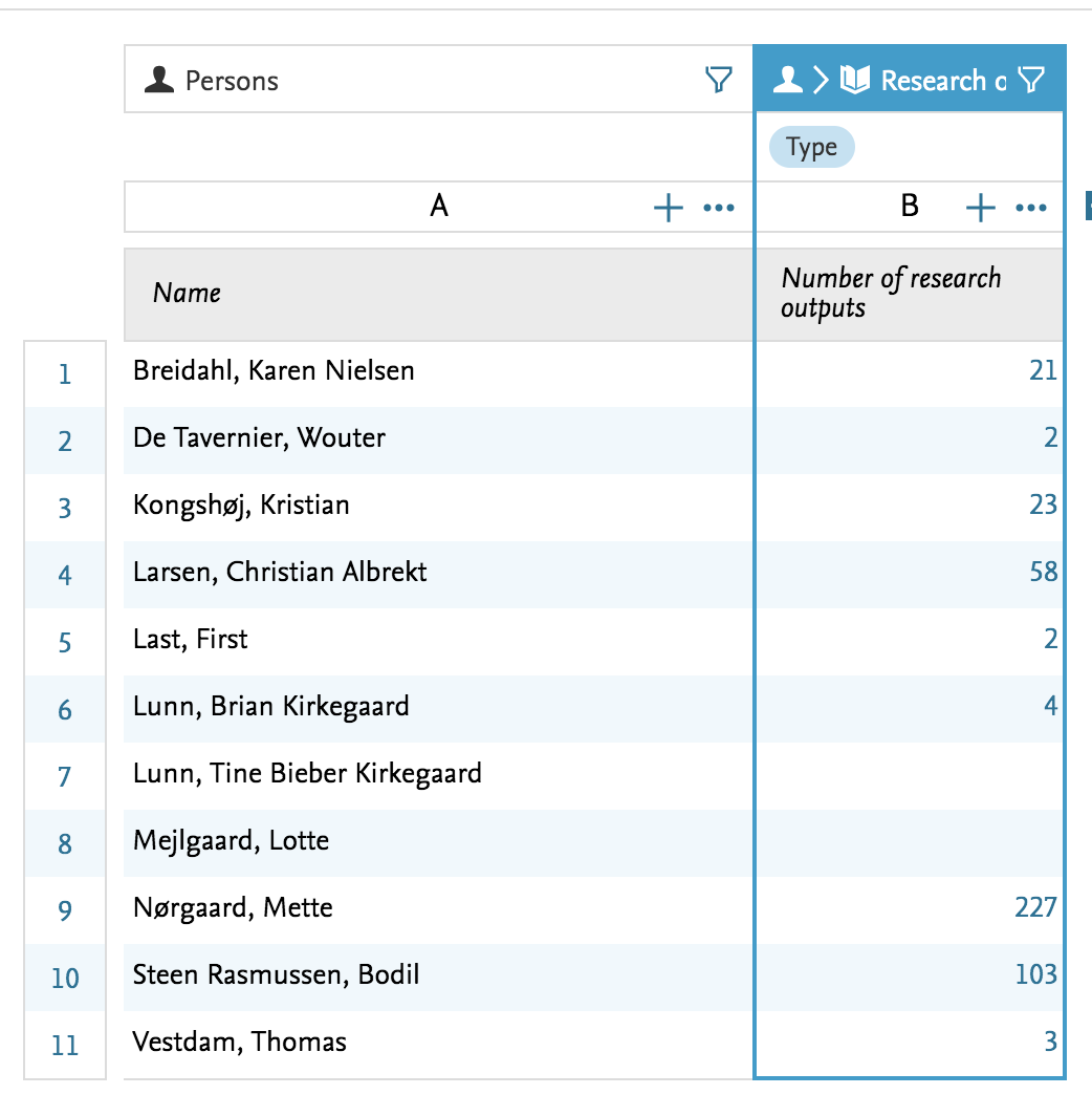
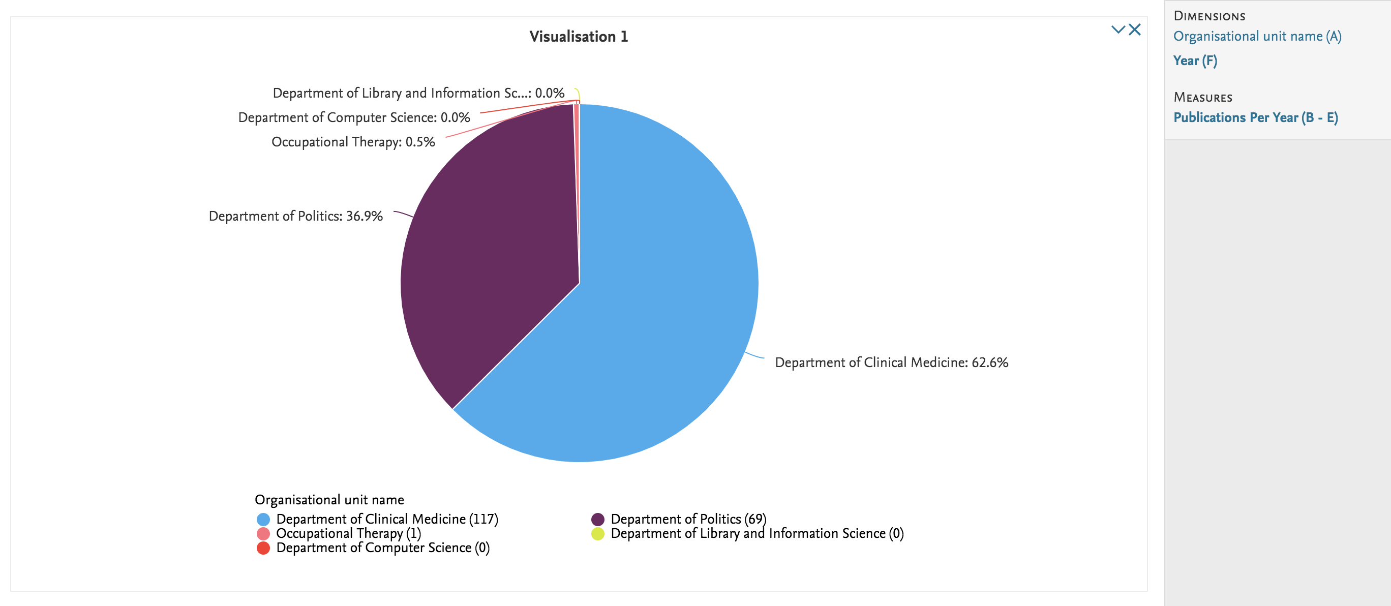
Add a column on workflow and view as a pie graph from the Data Table or create a Data Story that gives you the count per workflow step. Data Story solution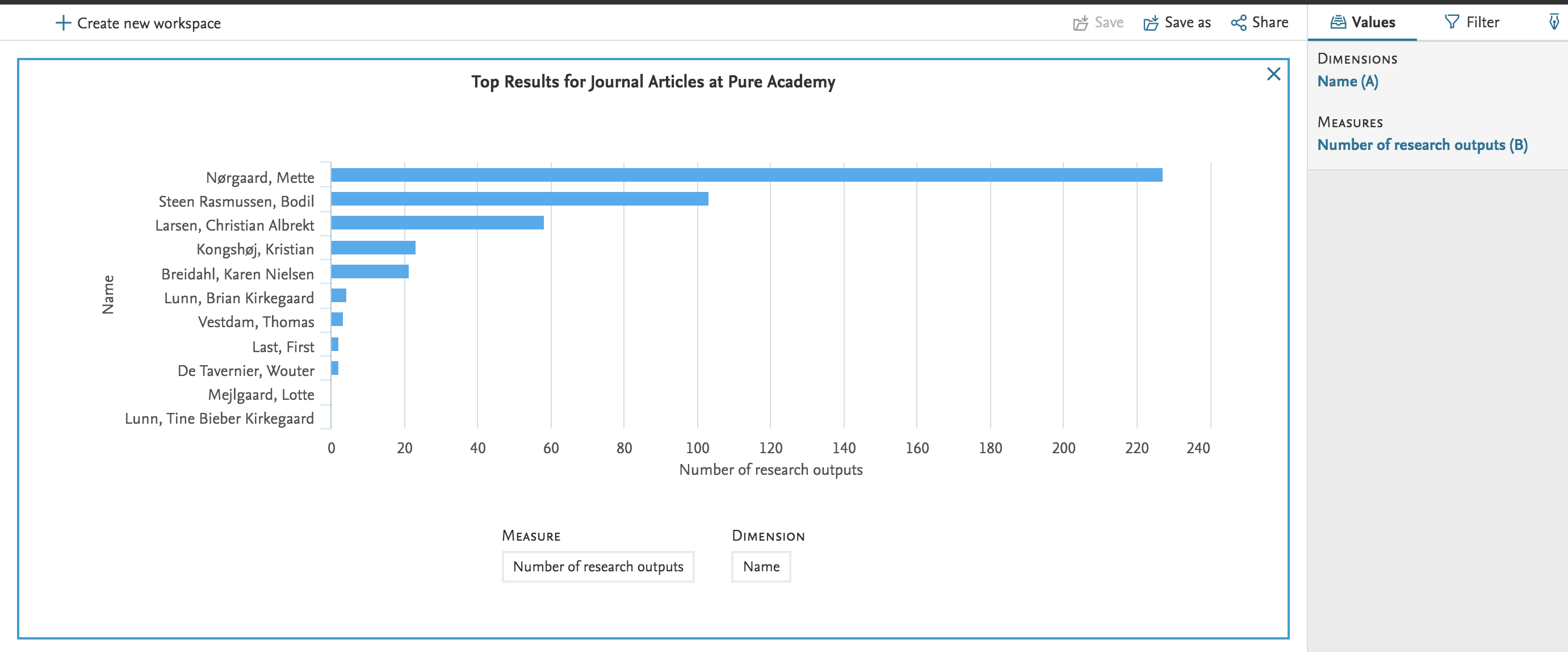
|
| Exercise #3 |
|---|
|
Create a list of Research Output based on persons currently affiliated to specific organization at your institution.
|
|
Solutions #3 Data Table solution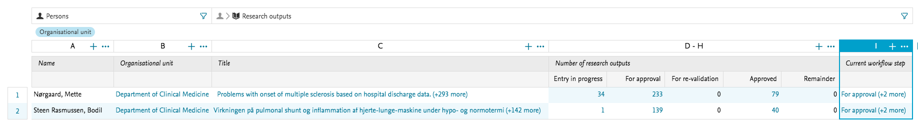
Add a column on workflow and view as a pie graph from the Data Table or create a Data Story that gives you the count per workflow step. 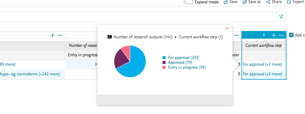
Data Story solution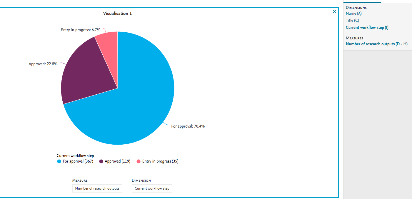
|
| Exercise #4 |
|---|
|
|
Solutions #4 Data Table solution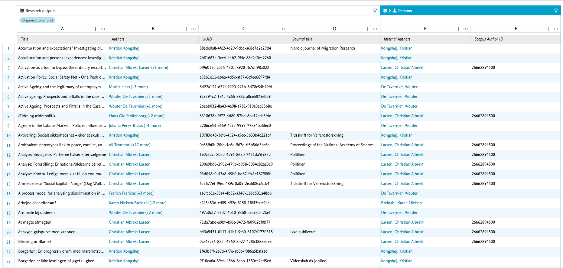
Data Story solutionReport did not include a measure, so making a data story is not possible with this example.
|
Published at November 18, 2025